“Data is the new gold.” We all are familiar with this phrase. Data can change how corporate giants do businesses, sports professionals plan their strategies and even win you elections. Data is a reliable form to present and prove hypotheses and abstract ideas to tag them as universally acceptable information. Data itself is a strong medium to prove almost anything concerning everyday world affairs. But to make the most of the data, we need to extract ideas, showcase them pleasingly, and use them to create an impact story. This forms the realm of data communication.
THE VISUAL STORY
Visualizing the data is a part of serving it in a beautiful, comprehensive, and compelling form that is a visual treat. Scientifically, we are more likely to remember the visual aspect of the information than in another form. Also, data needs to be represented in a way so that the end-user can extract the idea or the message from it based on proper observations. Data storytelling or communication is the ability to convey the idea to a large (and targeted) audience with a simple and clear message. The story behind the data must have a context. This broadly refers to why is the story is being told and for whom it’s mean to?
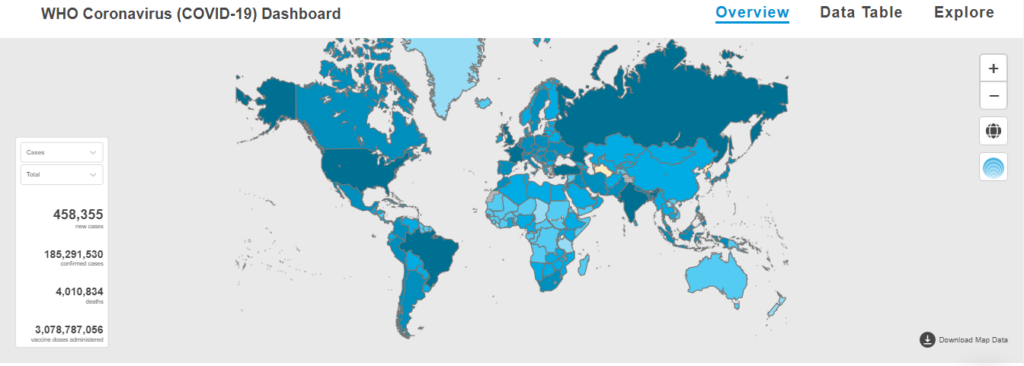
The need for a story arises when we want to showcase an idea hidden behind a data set; a data set is obtained from discrete or continuous record-keeping of an event or activity. We analyze the data, distill it until we observe a pattern, find the reason behind such pattern, and conclude. This can help us make decisions, maximize profit and minimize losses. For example, the following dashboard maintained by the World Health Organization keeps us informed about the global spread of COVID 19 cases in real-time. The darker areas in this visual are the most affected, while the lighter colored are relatively less affected. This visualization tells us the story behind how massive this pandemic has become. Similarly, giving a visual form can help you tell your story about a given data set.

TYPES OF DATA VISUALIZATIONS
Data visualization can be of two types, exploratory and explanatory. Exploratory visuals can help us find the fundamental reasons and Logics that lie beyond the data. Some basic questions about the data can be solved using exploratory visuals, like what? Why? These visual representations need contextual hypotheses or presumptions about a possible outcome. For example, how is the literacy rate of a state-related to its standard of living? Why do mineral-rich countries are some of the poorest in the world? Explanatory visuals, also called infirmity visuals, are used when a specific aspect of already established data is to be communicated. If the data is communicated in a comprehensive and empowering way, the audience gets to draw insides, identify correlations, recognize trends, and ultimately form their own fact-based story.
The need for a story arises when we want to showcase an idea hidden behind a data set; a data set is obtained from discrete or continuous record-keeping of an event or activity.
DATA VISUALIZATION TOOLS
Data visualization tools provide an easier way to create visual representations of large data sets. These data visualizations can be used for various purposes: dashboards, annual reports, sales and marketing materials, investor slide decks, and virtually anywhere else information needs to be interpreted immediately. This ability of data interpretation is called Business Intelligence. An enterprise could use data visualization to discover what areas in the organization are pulling it back. This could be in the business sector; business intelligence lets the enterprise identify some problem areas in their business.
A data visualization tool makes work easier, especially if you’re dealing with big data. Even then, there are numerous Data Visualization Tools in the market today. A good data visualization tool has the following features: First is the ease of use. There are several complex tools available for representing data in a visually appealing way. Some have excellent tutorials designed in ways that feel intuitive to the user. In contrast, others lack this convenience, thus eliminating them from any list of “best” tools, regardless of their other capabilities. A good tool can also handle huge sets of data. In fact, the very best can even handle multiple sets of data in a single visualization. It also can output an array of the different charts, graphs, and map types. Most of the tools can output both images and interactive graphs. There are exceptions to the variety of output criteria, though. Some data visualization tools focus on a specific type of chart or map and do it very well. Those tools also have a place among the “best” tools out there. Finally, there are cost considerations. While a higher price tag doesn’t necessarily disqualify a tool, the higher price tag must be justified in terms of better support, better features, and better overall value.
There are mostly 3 types of data visualization software; open-source, free data, and proprietary data software. The software version is fully paid for and is accessible via cloud or installed in the standalone client-server with proprietary.
Microsoft Power BI is one of the popular data visualizations tools. Its popularity can be attributed to its ease of use. It offers visual-based discovery, augmented analytics, data preparation, and interactive dashboards. It offers various data visualization capabilities and features such as visualization through natural languages and custom visualization. It offers access to cloud-based and on-premise data sources like Google charts or Google analytics. However, all these features come at the cost of an annual subscription from Microsoft. Nevertheless, it has got a reasonable justification for the price it makes you pay for it.
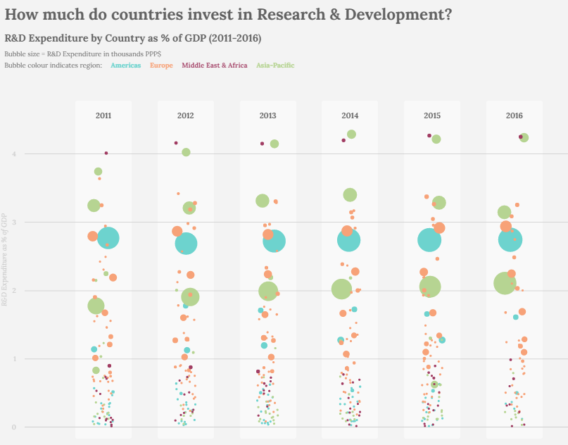
But, if you still don’t want to spend a penny on BI tools, go with Google Data Studio. Data Studio is one of Google’s Data Visualizations Tools that are designed with ease of use. It is free and open-source that lets you integrate data set to the Google ecosystem. It’s designed for enterprises that wish to integrate their Google data quickly. It may not fit businesses that need a high-functioning Data visualization tool as it may lack formatting and visualization. It turns information into informative, fully customized dashboards and reports that are easy to read, present and share. The best feature it offers is the degree of integrations it offers to create a data source. You can even use your YouTube channel data to create a dataset. If you are thinking of learning the basics of data visualization, try your hands-on Data Studio. Below is a visualization on Google Data Studio showing the difference in the research expenditure of countries over a period of time.

Tableau is another free Data Visualization Tools Open Source that allows creators to get used to the tool with little investment easily. It creates a platform for sharing data visualization and insights. Tableau Public is designed for customers who need to evaluate Server and Desktop applications. A tableau is a good tool for businesses that do not need vast features and want software that is easy to use and affordable. On the downside, the information and data used in the tableau desktop tool are public and can be accessed by anyone; hence they aren’t secured. Tableau comes as an open-source with a free plan.
Choosing the right and best Data Visualization Tools can be tricky, but it’s rather easy. Start by analyzing the features they offer, such as language support and cross-browser testing. Regardless of whichever tool you pick, you should also ensure that the tool meets your needs.
WHY TELL A STORY?
The art of data visualization might involve using shapes, geometric colors, graphs, and other things to represent your data visually. All you need is to create an interface that can be interactive. Now, you have the responsibility to showcase the data in the best possible way, and it’s up to the audience (or the end-user) to make the most out of your data. When it comes to storytelling, the responsibility is on your shoulders. Now you’re responsible for what the user gets from your representation of data. It’s much like the art of communicating expressions. Whatever you deliver must ensure that the audience must have a take away from it; that’s your responsibility. You have to prepare beforehand and think of the outcome before you start creating a story to tell. So if you were telling it, it’s your responsibility that people get it.
Almost everything can be represented in the form of data. And every data can be expressed in visuals. Data, when represented in a visually suitable way, always has a story to tell. And, a story based on authentic sources is the best way to make an impact and, largely, a change. Happy Communicating!
References:
- https://www.columnfivemedia.com/data-storytelling-brands-data-visualization/
- https://powerbi.microsoft.com/en-us/
- https://marketingplatform.google.com/about/data-studio/
- https://sfmagazine.com/post-entry/december-2020-storytelling-with-data-visualization/
- https://www.storytellingwithdata.com/
Also, Read: Unique Story of a Cyber Crime

Sandeep Poddar is the convener of Ignited Minds Science Club affiliated with VIGYAN PRASAR. He is a Science Communicator and develops and presents scientific content for Yuvaaz Podcast.
He can catch at; http://www.ignitedminds777.wordpress.com/

